
Facts mean a lot. The who, what, where, when, and why of cases can make all the difference in a case. Aside from finding the facts, there's also the important task of organizing them. If there are many facts, organization is what differentiates a compelling narrative from a tale full of sound and fury, but signifying nothing. That's why we built Casefleet: to help you build stronger cases on a solid foundation of facts and evidence. Our latest feature: Visual Timelines is one of the key components of our original vision of what Casefleet would do. Today, we're going to take a break from our normal blog posts on e-discovery and legal tech tips to show off our latest work, to show how we built it, and to give you some ideas for using it.
Timelines vs. Chronologies
In the early days of Casefleet, we called our facts management feature "Timelines," but some users were confused when they used our software: they would ask us where the timeline feature was! As we talked more with users about their expectations, we developed a few core intuitions about what a "timeline" should be:
- A timeline should have an axis that represents time.
- Each fact or event on the axis should be located at the point on the axis corresponding to the time when it occurred.
Ironically, when we had a feature called "Timelines" (now just called Casefleet), we had something that would have been better described as a "chronology." In a chronology, the events are in chronological order, but they usually are not separated from each other by an amount of space corresponding to the amount of time between them.
Making a Plan
Every feature has to start small, ideally with some specification of the minimal amount of functionality that would be useful. For Visual Timelines, this meant providing Casefleet users with a way of toggling between a "chronology" view of their facts and a "timeline" view – where the timeline view would show the facts as rectangles or bubbles arranged along an axis or line representing the range of time from the first fact in view to the last fact in view. Obviously, the bubbles could not overlap, and the feature would need to be strong enough to handle large quantities of facts – possibly not placing them all on the timeline at the same time, but at least providing the user an intelligent way of seeing any facts that were out of view, for whatever reason.
When the time came to start writing the code to build these features, we realized that a few key decisions needed to be made. (This often happens: as soon as you start thinking about writing rules for how a feature should work – i.e., writing code – some new issues emerge from the haze of wishful thinking.)
The first issue was how we would handle situations where there were big gaps in time between groups of facts. For example, if 10 facts occurred in July of 1970, and then nothing happened for a long time, and then several facts occurred in a single hour on January 1, 2010, the two "groups" of facts would be closely bunched together at different ends of the timeline. To avoid this issue, some timelines allow for "discontinuities" to be created on the time axis so that empty intervals are collapsed and the bunches of items at either end can have some space to spread out:
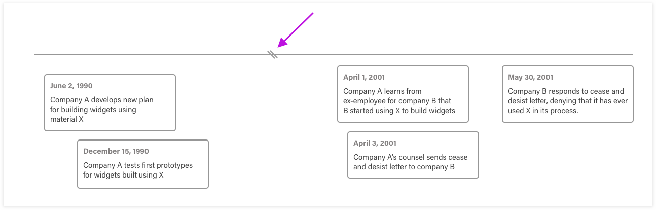
We decided not to add this feature, at least to begin with. One rule of software development is to avoid needless complexity. Here, we decided that the user would be better served by having two timelines, each instantly recallable using our Saved Views feature.
The next issue was the question of whether facts would all have the same width or if some would be wider than others. Again, the goal of keeping things simple was our guide: each fact would be 240 pixels wide, no exceptions!
With these constraints in place, developing a method for drawing all the facts in the correct location was actually pretty easy. The first step was to figure out how tall each fact would need to be based on the amount of text it contained. Next, we would sort all of the facts from the first to occur to the last and assign each fact a horizontal position based on the width of the page, the span of time from the first to the last fact, and the time when the fact occurred. Finally, we would draw each fact on the page, starting with the earliest fact, and place each fact as close to the axis line as possible without being too close to overlapping any facts that had already been drawn. Easy! Right?
Getting Somewhere
After making some hard decisions – such as keeping a constant width and not allowing discontinuities – we built up the feature, and it looked pretty good:
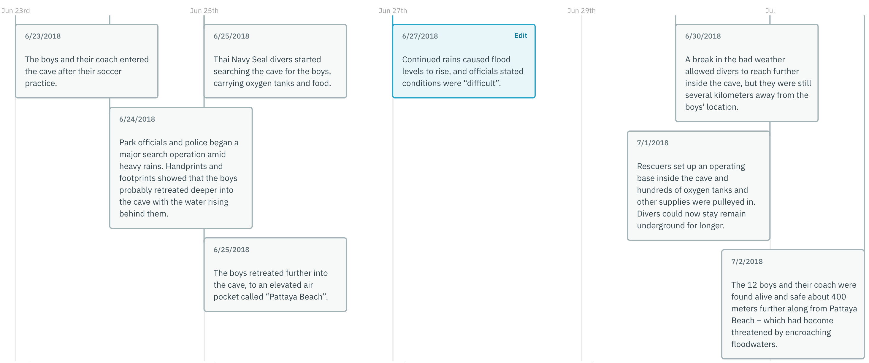
To add some visual flair to the feature, we enabled users to display the issues corresponding to each fact as colored circles on the bottom portion of the fact. Here's an example:
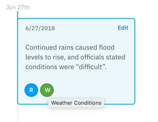
The full name for the issue appears when you hold your mouse pointer on top of it for a moment.
To facilitate viewing timelines with numerous facts, we made it possible to expand the width of the timeline itself by using a slider. The minimum width would be the current width of the page, but the timelines can be made extremely wide to accommodate long sequences of facts. In cases like this, it's very helpful to see at a glance where other facts are located compared to the section of the timeline you're viewing at a particular time; hence, the "Minimap" feature shown below:
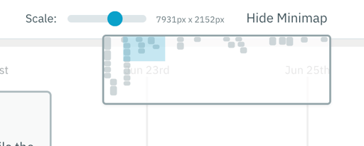
The blue square represents the part of the timeline that's currently being viewed. Each gray blob represents a fact in the position it occupies on the entire timeline.
Finally, we added download options intended to cover a wide range of uses. First, there's the ubiquitous format for sharing: PDF. Second, we enabled timelines to be downloaded in SVG format, which makes them 100% editable in software like Sketch or Photoshop.
Next Steps
We released Visual Timeline to current users in April of 2019. Similar to any other feature in Casefleet, we use feedback from users to refine and improve the product continuously. So far, it seems that we did a pretty good job defining the key elements that the feature would need to have to be very useful to the lawyers, investigators, expert witnesses, and others that use Casefleet. Best of all, the Visual Timeline mode has the most minimal learning curve imaginable: it's always a click away from the classic "chronology" view of facts that's been a part of our product for years.
Have any ideas for enhancing the Visual Timeline feature? Send us an email, or leave a comment below. If you haven't tried it yet, feel free to sign up for a trial or demo today!